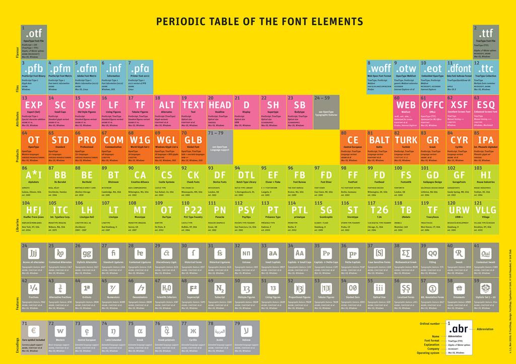
What's Wrong With My Web Font?

The @font-face attribute has changed the face of web design, allowing designers to move away from the system default fonts and into a new realm of diverse, rich, & interesting fonts. Here are 3 things to keep in mind when choosing a web font to ensure that your users are getting the design experience you intended.
Watch Out for Poor Anti-Aliasing Anti-aliasing refers to smoothing the edges of the fonts, rather than displaying them with pixelated (jagged) edges. The font rendering on Windows does not always do smoothing by default. So you can enable it your own computer but there is no way to ensure it is enabled for viewers visiting your site. Here are two of the ways to get around that:
Choose another font – This will look better or worse depending on which font you choose, what font type, as well as what font sizes you will be using. Some fonts look better large and vice versa. Font replacement – This means displaying the font with a completely different method from the browser’s default text renderer. This way your font will always render the same, assuming that whatever technology you’re using (ex: javascript, flash) is enabled & supported. You can also check out “A Closer Look at Font Rendering” by Tim Ahrens in Smashing Magazine for a breakdown of how font rendering works.
Don’t Forget to Set a Default Font The cold hard web-font truth is that the @font-face tag is fairly new and only compatible for newer versions of browsers. You will definitely want to take into account both audiences.
First, make sure that you specify a default font-family after setting your cool new font. Depending on what font you’re using, you will want to use a default font that looks similar to your new font:
h1 { font-family: ‘myCoolNewFont’, arial, helvetica } “Common Fonts to all Versions of Windows & Mac Equivalents” is a helpful list of potential default browser fonts.
Second, double check your font weight. Header tags are bold by default (font-weight: bold). When using a font that does not have a separate bold version of the font, the browser will apply a “fake bold” to the font. That results in certain parts of the fonts being thicker than were intended. and it can look out of proportion and just plain weird.
Simply setting { font-weight: normal } does not take into account viewers who will see your page using a default font. Those headers will also be set to { font-weight: normal }, which hinders their visual effectiveness as a header. Here are two potential ways to get around this:
Font selection – Again, some web font packages come with secondary bold versions of the font so you can use one of those instead. When using a font replacement you will also need to specify a secondary bold version of the font. Now { font-weight: bold} will render as expected. Modernizr.js – This is something I recently found that checks CSS3 compatibility and lets you assign a CSS styling for either scenario. For example: h1 { font-family: arial, helvetica; font-weight: bold }
.font-face-enabled h1 { font-family: ‘myCoolNewFont’; font-weight: normal ; } Pretty sweet, eh!? Download modernizr.js here: http://modernizr.com
Google Font Bug! Last but not least, Google has a great Webfonts API and you can load fonts directly from their server. I noticed that the vertical spacing is significantly different when viewing it in Chrome on Windows. The best solution I was able to find is to manually upload your own version of the font kit from Font Squirrel and use that instead.
Endertech is a Web Design Company in Los Angeles able to provide solutions for your website development needs. Contact us for your free consultation.
Top Photo Source: Font Shop (https://www.flickr.com/photos/fontshop) under http://creativecommons.org/licenses/by/4.0

