Why Create a Dark and Light Mode for your Site?

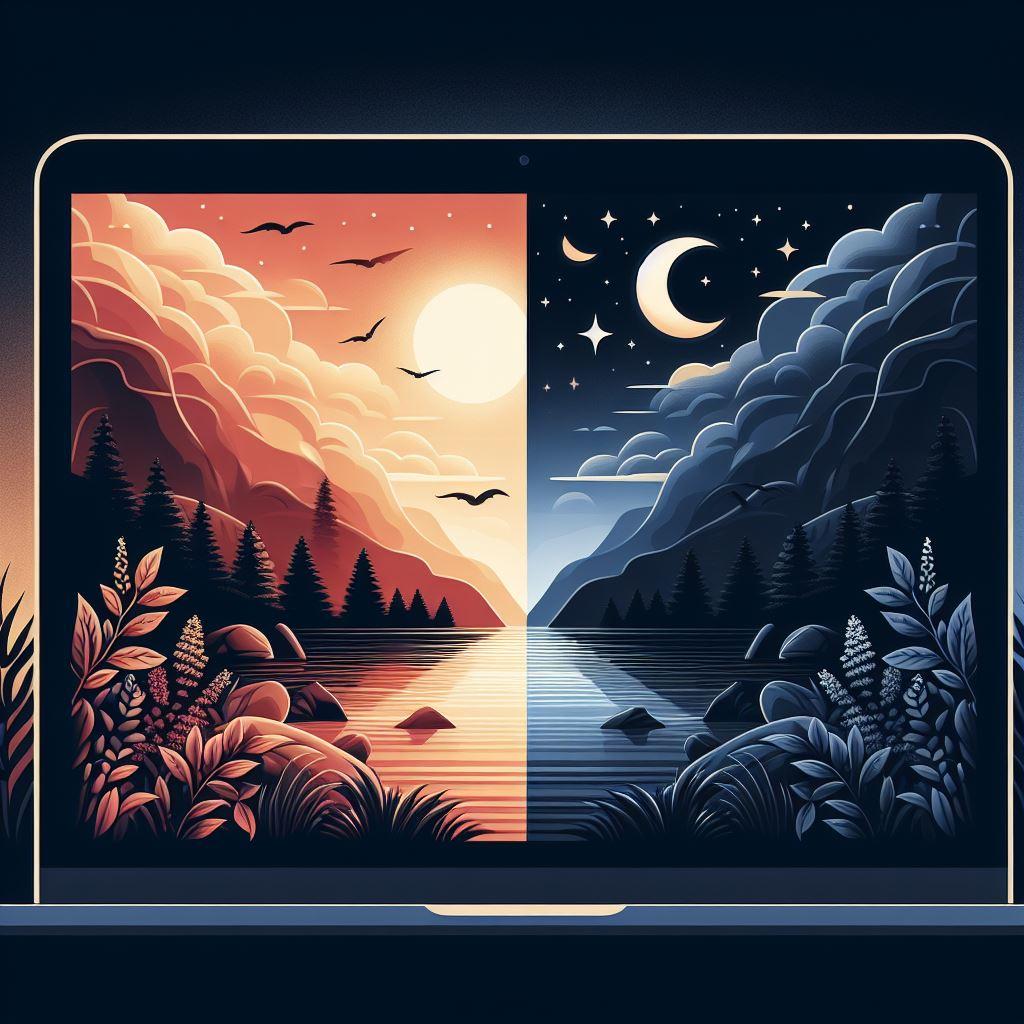
Have you been to a modern site that has sun and moon icons in the corner of the page? If so, that generally means the site supports dark and light themes. These themes act as they imply, light mode renders a site using a brighter color palette, while dark mode uses a darker color palette.
You may be wondering if this is just a gimmick or if it actually provides a benefit to your users. Well I’m happy to report that it does indeed provide value to users, which in turn translates into value for you because happy users are more likely to use your site. Let’s look at some of the benefits.

Accessibility
People with certain visual impairments may need either mode, depending on their condition. Dark mode is good for people sensitive to light, and light mode is good for some people with low vision since it has higher contrast.
I can relate to these, I find that with sites that have a black background and white text, when I look away from the screen the lines of text are almost ‘burned in’ and it overlays my regular vision for a number of minutes afterwards. It really bothers me so I appreciate sites that have a light mode.
User Experience
Some users feel strongly about sites that have mostly white or dark backgrounds. Eye strain can be experienced with white backgrounds, but it can also depend on the user’s environment. For eye strain, dark mode is good for dark environments and light mode is good for bright environments.
Some users also just prefer a certain background and will appreciate the ability to pick their preference. It may even help user retention if the user absolutely must be able to use one or the other.
Modern and Sleek Design
Having a dark and light mode is a sign that your site is keeping up with the times, is well maintained, and cares about providing users with the best user experience and conveniences.
Energy Usage
Believe it or not, light mode uses more energy than dark mode, so laptop users might be more inclined to use your site and appreciate this capability.
Competition
For almost all of the reasons above, if your site offers dark/light mode and your competitors do not, that makes users more likely to use your site over your competitors if any of the above factors apply to them.
Final Verdict: Dark Mode or Light Mode?
Overall, we recommend adding a dark and light mode to your site. This is partially because we like using this functionality ourselves, but more importantly there are many scenarios outlined above that bear consideration in terms of user benefit.
And it’s important to note that the scenarios are varied, people will use it for a variety of different reasons, so it’s much more likely that one or more will apply to any given user.
In terms of weighing the benefit of an enhancement, one of the key questions is how many people will use it. The higher the number of people, the more worthwhile it is. For all these reasons, we recommend adding a Light and Dark mode to your site, and it’s why we added it to ours.

